
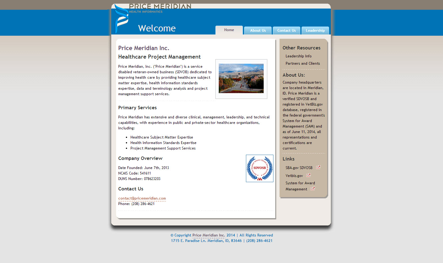
Full size version of project site created in June 2014
When a past colleague needed a site for his new business, he asked me to create something unique to his needs. He wanted a simple site with some specific content, not a lot of images, and not in some of the cookie cutter styles typical on Weebly or Wix. He needed it set up fairly quickly to support contracting bids.
Because of the short deadline, we decided to adapt an existing template rather than start a fully custom site. I found a few open source CSS templates and used one that he liked, then modified it for his own logo and matching color scheme. The template did not include mobile-friendly options. Although it was viewable on mobile screens, it required pinch and expand options to zoom in. Once the site was launched, I decided to create a modified style sheet for screen sizes between 50px and 500px, with a simplified banner/logo.
I applied responsive web design options to the existing older style sheet to create a mobile version that will load based on the size of the screen used to view the site. The mobile version is shown below:
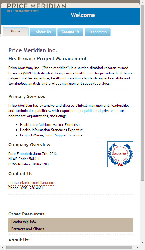
Mobile version, automatically loads for small screen based on CSS3 media settings